If you’re creating a game, there’s a lot of things to care about; balance, fun, component count, graphic design, and more! One thing that I like to take into account it trying to make the game as accessible as possible and one way to make your game more accessible is to try to make it color blind friendly.
Why does it matter if a game is color blind friendly? Only a small percentage of the population actually is color blind, so why make sure that they can play your game, especially when there’s several varieties of color blindness?
The short answer is that making your game color blind friendly makes the game better for everyone.
If a color blind person can differentiate all your components easily, then so can someone that’s not color blind. Making everything distinct means that no one is worrying about the colors of anything and that means that you can get to the fun a lot faster. Plus, just because only a few people are color blind, doesn’t mean it only affects that person when they play. I know when I play a non color blind friendly game with my color blind friends, I feel really bad every time they make a mistake or take longer on their turn. Who likes seeing their friends struggle? I’d say that most people don’t.
How do you go about making your game color blind friendly?
- Use Symbols AND Color
- Take advantage of Tools
- Avoid using Semi-Transparent Components
- Use Different Shapes for Physical Components
Use Symbols AND Color
Always use symbols AND colors to denote differences, not just color. You could go with just symbols, but having colors and symbols makes it easier for people that differentiate using color so that it’s easiest for everyone to know the differences you’re trying to convey.
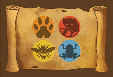
In the above example, each icon is paired with a color and each icon is very different.
When you do choose symbols, the simpler and more different the symbol is, the better. For example, a circle, square, and triangle are easy to tell apart, but a triangle and an upside down triangle are not. Some people will have no problems, but some people will.
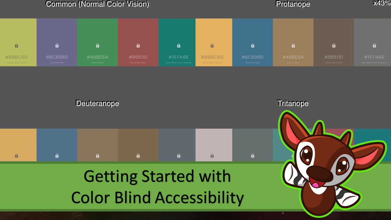
Tools
Make your color palette one that is good for most vision types by using a tool to see how color blind people see your colors. You should try you color palette alone and on components to get a real look at how your colors can appear.
- Website: https://www.color-blindness.com/coblis-color-blindness-simulator/
- Phone App: https://play.google.com/store/apps/details?id=asada0.android.cvsimulator&hl=en_US (android) or https://apps.apple.com/us/app/chromatic-vision-simulator/id389310222 (ios)
The above color palette was trying to find four colors that worked together, with the 3rd and 5th color being the ones that were being tested to see which was better. Neither color was particularly great, as the 3rd and 4th colors and the 2nd and 5th colors were pretty close to each other for those that have deuteranopia color blindness.
The traditional color palette of green, red, blue, and yellow uses a green and red that look nearly identical for some forms of color blindness and you can easily get away from that by using a different color, such as white or black instead of the red or green.
Avoid using Semi-Transparent Components
It’s much harder to choose colors that work well for all the different types of color blindness when the components are semi-transparent, especially in different levels of light. Making sure that components are opaque or not semi-transparent makes things way easier to be differentiated.
However, if you do need to make components semi-transparent, you can give one or two colors differences so you can tell them apart. For example, if you had blue and purple acrylic dice, you can add sparkles to one to make it stand out more.
Use Different Shapes for Physical Components
Make wooden or plastic bits different shapes so that you can tell the difference between them that way. For example, if you have meeples of different colors to differentiate players, the meeples can be different shapes. This is also a nice way to add in a fun touch of theme, while making the game accessible as well.
Conclusion
If you put in a bit of effort, you can make your game a lot more enjoyable for everyone that plays it. This isn’t the only kind of accessibility that you should try for, but it’s one that can make your game so much better, at little to no cost. I love my color palette that I use AND it gets people excited, as it’s more rare to see bright colors on player meeples, especially purple and orange, which are really great to use in a color blind friendly palette.
Did you enjoy this entry? Please let me know I’d love to hear what you think and what kind of things you’d like to see from this blog. Feel free to send me an email or comment with your thoughts!
Don’t forget to sign up for my mailing list, so you don’t miss a post: https://tinyletter.com/carlakopp
This is awesome! I’ve always had trouble picking colors and the app looks epic for choices! I also never thought about the use of iconography in addition to color as a way to aid in color blindness accessibility… I knew it helped to see what different things are for but never realized the added bonus! But the really cool piece was the use of different shapes for different things. I totally agree that it adds fun, but never considered that as beneficial for color blindness too
PS: yeah the orange meeples are awesome indeed
I feel like I’ve sold games before just because of my different color palette, as some gamers are just so eager for games not to be the regular blue/green/yellow/red. But also a color blind person can typically see that I put in the effort so they’re much more comfortable buying games that they’re pretty sure aren’t going to lead to issues.
Well done, Carla. Thanks for writing about this topic!
thanks for saying that! I really appreciate it!