I’m talking today with Sarah Reed, co-designer of Oaxaca, Project Dreamscape, Scrapyard Rollbot, and several other fantastic games.
Introduction
Tell us a bit about yourself.
I’ve been a gamer all my life. My grandma and aunt played board games with me as a kid. In high school, I moved more to video games, but also discovered Magic the Gathering and role-playing games, which continued into my college years. I introduced those to Will, my then-boyfriend, now-husband. We continued mainly with Magic, Munchkin and D&D until 2012 when we discovered the rest of the modern board game hobby with games like Dominion, Agricola and Seasons, diving head-first into the deep end. It didn’t take long to get into designing games, which we’ve continued to do along with amassing a huge board game library. Our other big hobby is LEGO. We have a LEGO room in our house and quite a large collection there too.
What’s your favorite role that you play in the industry?
I love being a positive voice on social media. I advocate for mental health awareness, accessibility and just general positivity in the board game hobby/industry. There’s so much negativity in our lives and I feel board can give us a break from it, and help lift us up. Board games have helped me a lot in my struggles with mental health and chronic pain. I have definitely overcome a lot of challenges with Imposter Syndrome and depression, mostly due to the impact of board games and the people in the hobby/industry.
What’s your favorite thing that you’ve created or done in the industry?
Back at the end of 2013, I created the Play 10 Board Games 10 Times Each Challenge. I originally created it for me and a few friends who were frustrated at always playing new games and never getting into the meat of games, never learning the strategy or getting to the point of just enjoying a game on a deep level. So at the beginning of 2014, I started up a Geek List on Board Game Geek and I expected maybe 20 people to join. I wasn’t prepared for the hundreds and then thousands of people that joined. The challenge really struck a chord in people and it spiraled out, way beyond Board Game Geek, way beyond me. It’s been going strong since then and it always makes me smile when I hear people talking about the 10×10 challenge and they don’t know I created it. I’m just so happy to see people enjoying themselves and seeking a greater fulfilment in their hobby.
Here’s the 2020 BGG Play 10 Board Games 10 Times Each Challenge: https://boardgamegeek.com/geeklist/265720/2020-challenge-play-10-games-10-times-each

The 10×10 Challenge has gotten widespread enough that you can buy your own 10×10 Challenge board from a variety of locations! The above one from https://www.basicallywooden.co.uk/accessories/10-x-10-game-challenge-tracker/
Is there anyone that’s inspired you in gaming industry?
This is a tough one because there are so many amazing people in the industry. I’ve been blessed to get to know so many, but my thoughts immediately go to Suzanne Sheldon. She is like my lighthouse. Strong, undeterred by the rough waters that crash against her, trying to put out her light. She inspires me to be me, fully embrace who I am and to put my voice out there to try and help others. Plus, she likes pie and pie is the best.
Suzanne is on twitter @425Suzanne.
Vision Accessibility Questions
What first got you interested in making games that were accessible to those with poor vision?
My husband Will is why. He is legally blind and color blind. So teaching him to play Magic the Gathering all those years ago was extremely challenging. The game requires you to keep your hand of cards secret. At that time, his vision was still good enough that, with a magnifier, he could read the titles of the cards, but everything else was too small or indiscernible for him. Thus, he took to memorizing his cards by name, as well as learning what all the other cards did so he didn’t have to continually ask for cards on the table to be read to him. This would have been fine in most games, but Magic is a collectible card game, which means a new set of cards are released almost every 3 months. A new release meant we bought a new box of cards and it meant him memorizing new cards, something that gave him a headache for quite a few days.
Fast forward to us getting into other board games, we quickly learned that there were other obstacles for him in games such as maps or tile-laying games or games that relied on the same sized cubes that were only different colors. Some obstacles were easier to overcome than others, me helping him separate his cubes into piles and reading cards to him. But other obstacles couldn’t be overcome so we just didn’t play those types of games.
So when Will wanted to get into designing games, it was a pretty logical step to do our best to make games as visually accessible as possible, which mostly meant making our games with as much open information as possible so that sighted people could help those with vision challenges.
The other day, you mentioned that hidden objectives were bad when playing with anyone with poor vision, as they would need to be told what their hidden objective is. Are there any other mechanics like this that you would avoid when trying to be accessible specifically for those that have poor vision?
Hidden information is definitely something we avoid designing with as it will often require someone else to help the person with vision issues, and sometimes it needs to be someone not involved in the game. Otherwise, we also don’t design with maps and or anything with a heavy spatial aspect to it. Tile-laying games are very challenging for someone with poor vision to keep track of. Some are easier to play than others. For example, Will plays Kingdomino with just a little assistance because the space is restricted to a 5×5 grid. Any games that have a small grid will be easier for someone to keep track of in their head.
That’s the biggest thing I’ve learned about how Will plays games. He doesn’t look at the board or anything on the table. It’s all visualized in his head. Now, not everyone who is visually challenged will be able to do this, but it something to keep in mind while designing games. The simpler the space the game takes up, the easier it will be for a visually impaired person to keep track.
What are some really good mechanisms when playing with those with poor vision?
It’s often more about design choices than specific mechanisms that will be good for those with vision disabilities. For instance, deckbuilding isn’t going to be necessarily any better or worse for sight issues, but it’s how its implemented that makes it easier or harder.
For example, Will loves playing Dominion and its really easy because no one can play cards on another player’s turn, so when it gets to Will’s turn, I simply read his cards to him. And it doesn’t negatively impact anything. However, some visually impaired folks might not have a sighted person that they feel comfortable fully relying on, so the hand of cards being hidden information might be an obstacle for some. This means designing a deck-building game that is fully open information would make it somewhat less burdensome, even though someone will still need to read the cards to them.
So sticking to open information or using components that can be easily felt to determine its shape, will greatly improve the gaming experience for those with vision challenges.
Is there a size of cube or token you would recommend?
It’s not so much the size as the shape. The shape needs to be distinct so someone can pick it up and, without looking at it, be able to feel what it is. This will often mean that bigger tokens are better, but not always.
What’s something that is often forgotten that makes playing games harder if you have poor vision?
Information overload. A lot of games have a lot of complexity built into the components of the game, rather than the rules of the games. All that text or symbols on the components is something that sighted people take for granted because we can glance at it, at any time we want, and be reminded of the information we want.
For someone with vision issues, they can’t always just read the text or decipher the symbols to be reminded. They often have to memorize the information or ask someone else to remind them of the information. This can often mean that people with vision disabilities choose to play lighter games. Not always because they want to, but because that’s what they can mentally process and still have an enjoyable time.
What kind of workarounds have you found to make games work better for you?
Honestly, I haven’t modified many games. Mostly because Will is able to keep so much information in his head. But we have added braille to card games, like No Thanks, so that his parents can play it. Braille is often a great way to modify a game to be accessible, but not everyone with vision issues knows how to read braille. And it has to be added in such a way as to not obscure the printed information for those with good sight.
We have modified simultaneous play games so that everyone but Will makes their choice and then I help Will to make his choice. It still means that many quick-playing or timed games are inaccessible, but it has allowed us to play many more games that we wouldn’t have been able to without modifying some rules.
What tricks have you learned with fonts or icons to really make them stand out?
The biggest trick is contrast and, sadly, one that so many seem to not know. For those with poor vision, black on white or white on black is the very best. It provides the most contrast for eyes to be able to determine what’s to be read. There have been games that have been rendered unplayable for Will because they put a light pastel colored font on a white background and it was a game that required hidden information that would break the game if I read it to him.
For fonts, stick to the simplest fonts possible. Sans-serif is the best. The worst thing you can do is make the instructional text in some crazy swirly font. It’s bad enough when titles are rendered unreadable because of font choices, but you don’t want a person to be unable to read how something works.
Icons are also really challenging. Simple is better. I know, not very fun, but shapes are best. And make them large. How a person’s vision works varies greatly from person to person. There may be blind spots and the person’s brain is trying to compensate for those by creating a whole image from what it can see. If the icon is too intricate, too artistic, they may literally not be seeing something in the icon that is critical information. The biggest thing to remember is an icon is not art. Do not use art as icons.
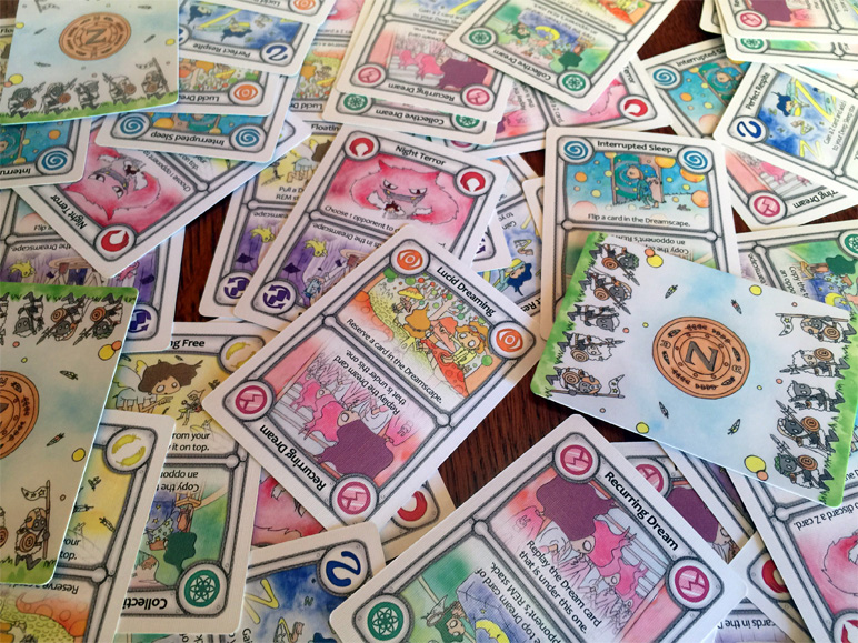
Is there anything you learned about designing with poor vision accessibility in mind when you were creating Project Dreamscape?
The biggest flaw we discovered for people playing Project Dreamscape is being able to read the cards from a distance. The good news is that this only impacted people first learning the game because we kept the abilities pretty simple. So once a player got familiar with the 8 original abilities, they could simply look at the icon or the art to know at a glance what the cards did. However, we did go on the more pastel color palette so, for some people, it will be difficult for them to identify from a distance. The good news is we kept everything open information, so as long as there is a sighted person willing to help, it is playable by those with vision challenges.
Is there anything you learned about designing with poor vision accessibility in mind when you were creating Oaxaca?
From what we learned in Project Dreamscape, we kept the icons all black on light background, so they stood out easily. However, we still had some stumbling blocks with making the icons on the dice simple and distinct. Tableau-building games are always going to be visually challenging, for everyone, as it’s difficult to see what your opponents have across the table. We used mini cards to reduce the sprawl of the game, but that also made it more difficult to know what your opponents could do. Thankfully, in our playtests, most people were amenable to reading their cards out-loud to others, and the small footprint was important to us, so we stayed with mini cards. I think we ended up with a decent result, but there are definitely things we will do differently next time.
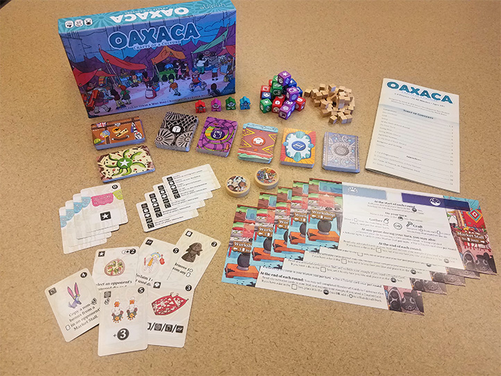
Oaxaca can be purchased here: http://undinestudios.com/oaxaca.html
Is there anything you would advise people who want to make their games more visually accessible?
I think a key thing to remember is that not all games have to be accessible to everyone. Mostly because it’s impossible. However, I think every game can benefit from making it as accessible as possible to as many people as possible. If only because it widens your audience and you can potentially make more money. That’s good business sense.
However, if you’re making a dexterity game, don’t give up your dexterity mechanisms simply because someone with a physical challenge won’t be able to play. You can, though, try to think on how you could make it easier for some physical challenges. Maybe something that requires two hands can be changed to require only one hand. Or maybe there is a device that can be used to do the dexterous element, rather than rely on the strength of a hand.
The same goes with making a game more visually accessible. If your game requires hidden information or a large map, and taking those away would radically change the game in ways you don’t want, then don’t do it. Just look at how you can make things better. Use simple fonts, larger lettering, simple icons, high contrast, etc. In the end, making it as visually accessible for those with severe vision issues will make it better for everyone. Our daily lives abuse our eyes with excessive wear and tear. Simply aging makes our eyesight worse. Plus think about the setting in which people will play. Not everyone has great lighting. So using red text on a black background may just not be readable in dim lighting, even for someone with perfect eyesight.
The biggest thing is to just try. Ask others for help to make your game more accessible. And do it as early on in the process as possible. Become aware of the challenges people face and then just do your best to meet people’s needs so they can enjoy your game as much as possible.
You can find Sarah on twitter @EuroGamerGirl
Did you enjoy this entry? Please let me know I’d love to hear what you think and what kind of things you’d like to see from this blog. Feel free to send me an email or comment with your thoughts!
Don’t forget to sign up for my mailing list, so you don’t miss a post: https://tinyletter.com/carlakopp
Excellent article!!
I’m a Teacher of the Visually Impaired, an Orientation and Mobility Specialist, and a Board Game Designer. I’m always looking for ways to join the world of my blind and visually impaired students to that of their sighted friends and families and therefore this article was really inspiring 🙂
I’ve been using a 3D printer to help bridge the gap, whether it be to make or adapt board games, design tactile maps, or facilitate three dimensional expressions of my students ideas, and I find the ability to quickly iterate with the technology really helpful.
I’ve seen more and more creators adding their cool stuff for the visually impaired to places like Tinkercad and Thingiverse and so I thought I would chime in and let people know.
You can find amazing prints like braille dice all the way up to d20, and Braille versions of Settlers of Catan.
Thanks again for sharing such a wonderful article 🙂
Matt
Great article! Thank you both for taking the time to share your experience!